Wednesday, February 24, 2010

LOGOS


Our task was to sketch our own designs for three business 'forever florist', 'heavy T Gymnasim' and 'Pearly White Dental Clinic'. We then had to look up these types of business on the net and find things we liked .. this is what I found.

Florist logos:


I like this Logo as it was very similar to the one i created, incorporating the flowers into the name. Making the logo ironic, so to speak.
The logo is colourful, simple and in my opion effective.


Im really drawn into this Logo, its alot busier than the other logos but I believe it is still effictive. The green tones represent what you would compare with nature ie flowers. The logo has a floral effect throughout the name


I found this logo much different to the others. The shape of the logo was more a square shape than a rectrangle and had alot less colour. This logo still caught my eye due to the long flower sybolising the 'i', the plain black and white made it elegant and simple.

Gymnasium Logos:


This logo stood out to me as i was very simple with a picture of a man running with the business name in rings. Also the name itself stood out becuase the didnt use gym or put a muscly guy they used "health and fitness' as part of there logo so people that may be intimidated by gyms feel more at ease.

I really like this Logo, a 'heart pulse' is used throughout the name. Which at a gym what you want to do is to increase your heart rate to burn 'fat'. (well for most of us ladies we do). The word Max at the end gives me the impression that if I started going to this gym I would get Maximum results perhaps.
I like this logo as there is alot of words in the logo but the have made it simple black and white so you dont get lost. They have a little picture of the world in the name of the business 'world' which makes the name of the gym stand out more and catchs the attention of the eye.


Dental Logos


The blues and tidy aspect to this logo draw me into it. Its has many levels and differnt sizesand fonts throughout the logo, making it have it own unique style.
I like this logo as it is 2 plain colours throughout the logo which is the black and the red and the lines in the logo look like a tooth which i thought was very clever how they have put it together. It looks very professional.

I like this logo as it is simple wording of the business with a W on the top which perhaps adds something to the design and draws your attention in using the line through the W.


These are the images I sketched


Photographs .... (to be continued)

Larry Clark

I found Larry Clark's work confronts youth culture, sex, drugs and violence.
The photo I have uploaded is one of my favourite from his work that i have come across so far. The picture is in your face and controversial. Larry Clark was one of the first artists to open up a new genre in photography and tell the truth behind the lives of the rich kids he hung out with.
The light in his artwork Tulsa with the picture of the guy injecting drugs into the girl is very dark and is very 'shocking' when you look at the image. There are no lies, it captures a moment in time that no one else new about other than these 'kids'.
The image is in black and white and is not centered and mainly focuses on the needle being injected into the female in the picture.

Araki


This photo stood out to me the most out of mojority of Araki's Photos as his wife is dressed in her japanese attire and looks so peacful sitting next to the water in her own world. What facinates me with his work is how Araki is so dedicated to his art and how patients his wife must be to always be in front of the camera.
The picture is set in black and white and the contrast is light. when i look at this picture i feel as though the subject is in a deep thought. I believe this photo is centered with Yoko being the main focus to this photograph

Richard Billingham


When I look at this photograph by Richard Billingham that he took of his father. You can see the honesty from his artwork. I felt sadened when i seen this as it must have been awful watching your father do this to himself.
Richard has placed some bread down for his father as his has only been drinking and has not eaten but his father did not touch the bread. The image captures such a emotional time in his life.
The image itself is quite dark in contrast, the positioning of his father facing away looking at the ground. It perhaps is a 'dark' time of his life.


Tony Vaccaro

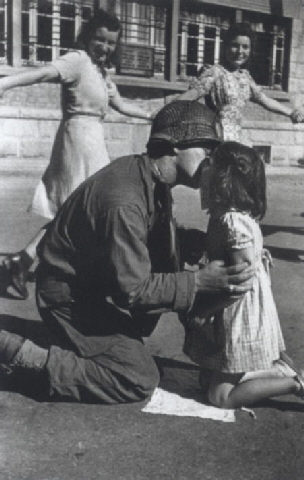
 "the kiss of liberation - 1945"

This Photograph by Ton vaccaro represents in my mind that 'daddy' has come home from war and won and everyone is celebrating. the girls are dancing in the background and smily. It makes me feel a sense of relief when looking at this photo. The contrast is light and the main subject is the little girl kissing a man (most likly her dad) who appears he has just come back from war.


Cindy Sherman


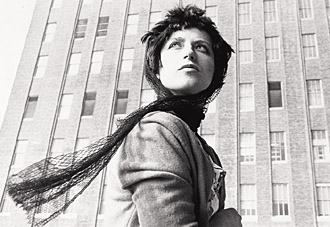
This photo by 'Sherman' is a self portrait of herself. Like many of the photographs she took she dressed in character and shot photos of herself.
I really like this photo and the lights shines on her face and bring out her features more. she is the centre of the photographs and behind we can see the high rise buildings.


Martin Parr


I really liked this picture by Martin Parr. To me it gave the impression the flowers are 'behind bars' but it also captured my attention because its different to most other photographs of flowers that you would see.
The image itself is very bright and I would say it is centered. 


Gregory Crewdson


When looking at this photograph by Gregory Crewdson it was kinda creepy but really awesome at the same time. Im not sure what the image represents but i like the way it is put together. The image has a very dark contrast and you get the feeling of being lost.


Jeff Wall

This photograph by Jeff Wall gives me the feeling of freedom an empty road with nothing else but nature on either side.
The minimal colors in the photo also give it an interesting feel.


Robert Adams

When looking at this picture by Robert Adams i like the fact that the image is not all in focus and you can see 'movement' which gives you a feel of how it may how felt in that environment at the time. which to me gives me the feeling it was windy.


Edward steichen

I really like this picture of Edward steichen of the 'pond' you can see the light come through in the background and it casting the shawdows on the pond.


Monday, February 22, 2010

Space Background

We were given the task to put random items on a space background and make it look half decent.
This is what i came up with ...

I'm not 100% happy with the end image and can defiantly find many flaws that I would like to fix when and if i get a chance.
xo

Wednesday, February 17, 2010

Fruity with Photoshop


My first go at using photoshop to cut out images and put them in a different environment.
xo

Thursday, February 11, 2010

GoT MiLk!!

Today we looked at a site called www.gettheglass.com, I thought the site was great.
The presentation of the site was awsome and very detailed. I loved how they introduced you to the characters and the colours and themes related to the concept of the story line.

The idea itself may have been a bit silly, and was quite frustrating as some of it went to quick and my dice always laned on 1, 2 or 3 and the police car always got a 6 (I definatly thought that was a bit unfair). my overall opion of this game is that its a fantatic concept and I can see that alot of time and thought has gone into it.

I didn't make it to the end of the game, but ill give it a go when im bored.

Skye xo

Tuesday, February 9, 2010

Welcome

Welcome to my first post.... Testing it out.
The journey begins!!