Report on critique given in class on assessment CUFDIG304A
Introduction
We were given the task by our teacher Luke to come up with a collection of products to be used in a promotional campaign for a business starting in Wagga Wagga.
We were asked to select one out of ten potential business industries to base our work on, I decided to choose hair and beauty.
We were then asked to produce a Logo, Business Card, With Compliments Slip, bookmark and a Brochure.
Once we had come up with our rough material we asked to present them to our teacher and fellow classmates at a critique to develop our products further.
Findings
I chose to pick hair and beauty as my best friend (we will call her my client for this exercise) was starting a spray tanning business. I presented my client with various idea for a business name, we ended up coming up with Glamour-Mobile Spray Tanning. She was not sure of a theme or colours so I told her Id come up with a few designs for her to choose from (as she knew it was also for my TAFE assessment).
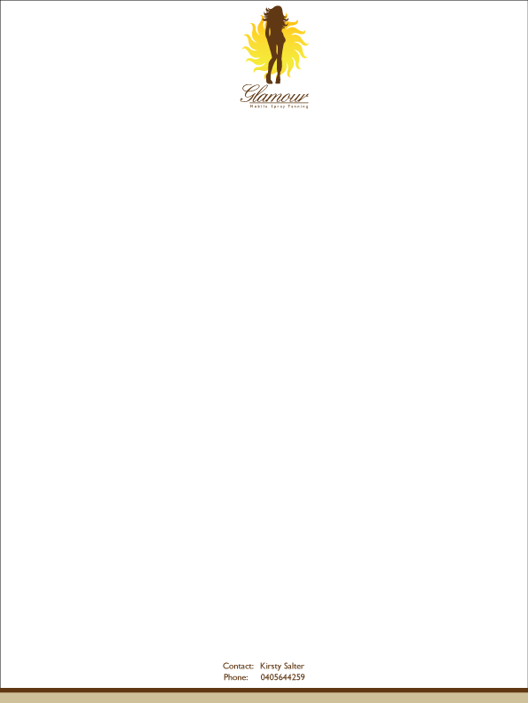
From the beginning of my design process I was very fond of the idea of a silhouette of a woman's figure. I then wanted to add the sun, presenting the logo like you had just been back from an exotic holiday with a beautiful natural looking tan, not the scary thought of the nasty orange tan.
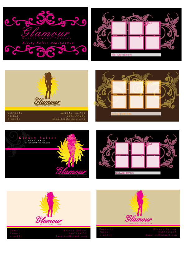
When researching other tanning places around the world I noticed a theme that was recurring with a lot of businesses, they all seemed to be using very natural colours similar to the art and crafts movement. I also created other ideas and logos which I presented to my client (all logos can be found on my previous post).
My client liked the design but was not sure about the colours as she wanted something bright and bold, I played around with colours and positioning of items (which can also be seen with previous post of original designs). She liked these ones much better but for the purpose of this assessment I choose to show the original natural looking coloured logo as I thought to myself you do not come out 'hot pink' when you get a tan and that is what colour the silhouette was.
Conclusion
During the critique in class I enjoyed receiving feedback on my work and what I could improve on. I had a lot of comments in relation to the stripes I used throughout my work. I originally put these stripes in my work to correlate with the colour’s in the sun but received feedback that they were distracting and took attention away from my logo and information I was trying to portray.
Typography was another area that lacked form throughout my work. The first thing that came up was that I hadn't tracked the writing in my logo and that the point of my font was that the 'kicks' were supposed to join together. The second thing being that all font sizes were different and that other from the display font all other type should be one size throughout my work. Not only that the type should be one size but there should be a maximum of three type faces throughout my work as too many styles confuses the reader and makes it difficult to follow.
When looking at the design elements in my letterhead I was advised that not only were the stripes too bold but also the positioning looked out of place and needed re-arranging.
A obvious point made was that I did not have enough white in my work, such things as the letterhead and compliments slip need white space to be able to write/read any necessary information in them.
The most difficult task I found was to produce the brochure, which defiantly was reflected in the feedback given. The main comment made was to continue using the one theme throughout all material and not add new elements to the design. With my design for my brochure a lot of people commented on changing the bottom half of the brochure so that the theme continued throughout all products. I was told although colour’s are very strong throughout my work they just needed to be simplified and not overused, the same comment was given with my images but a extra little care goes along way, this comment was made due to the face my image was cut off and not even along the bottom of my page, also the curves on the rounded boxes used in brochure were not even.
Recommendations
In order to develop my products further I will use the information I was given in the critique and also other material given in class to produce what I’m hoping will be a better finished product.
The critiques also educated me on others ideas and thoughts towards what works and what doesn't work. It showed me tips and general knowledge for future projects I receive throughout my course and career, that I believe will be able to help me.
21-05-2010
Skye Spencer
These are my finished products ...